




GTA 6 preview had one major let down and fans hate it
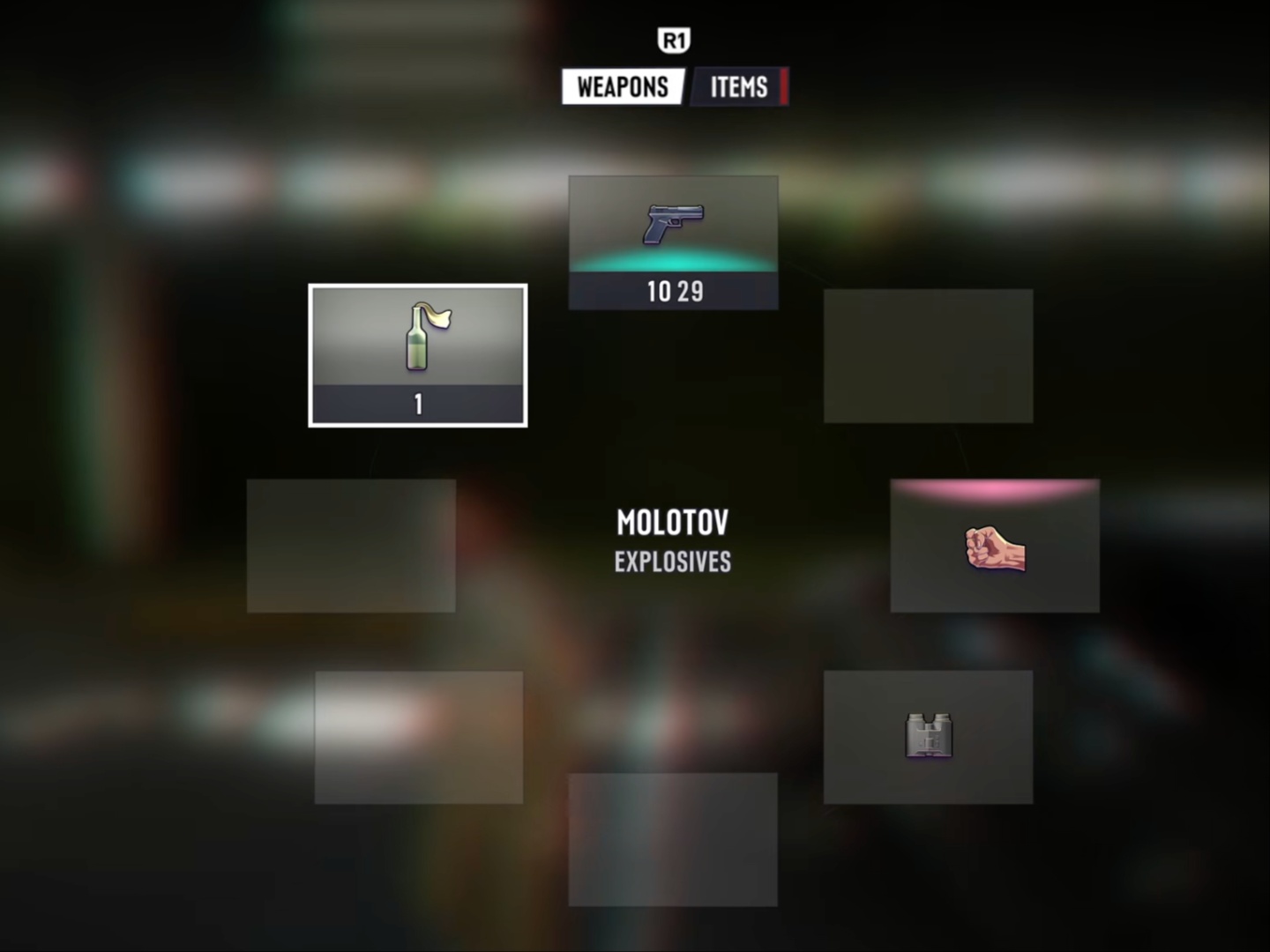
We saw glimpses of the UI and weapon wheel from GTA 6 through the leaks, even before the official Netflix extended look. However, it became evident after the official preview that it’s the final (or near-final) version of the UI. While every other aspect of the game is being praised, the UI seems to have become a point of contention.
If you thought that the weapon wheel in GTA 6 looks a bit too simple, you’re not alone. A lot of people have shared their opinions on the game’s UI, and most of them feel it’s not good. The comments range from “UI looks quite bad” to “genuine let down” to “am I playing Minecraft here.” During the almost 27-minute preview, there were several moments where the character used the weapon wheel, and it showed simple-looking boxes with weapon icons. It felt somewhat out of place for a game that’s as detailed as it is.
Some X users have shared their versions of the UI that arguably look much better. At this point, it is unclear if Rockstar will listen to the feedback and make changes. There are still almost three months left before launch, and changing the weapon wheel shouldn’t be a herculean task.
In related news, someone recreated GTA 6’s UI using AI, showing everything in one place. It has the map on the bottom left, the weapon wheel in the center, the wanted level and related indicators at the top right, as well as the character switcher at the bottom right. There are also HUD controls to toggle the UI elements on or off.
What do you think about the weapon wheel and UI in GTA 6? Should Rockstar make some changes? Let us know in the comments below.
 Add as a preferred source on Google


