Razer redesigns logo to promote social distancing and it's actually pretty nice
With entire countries and counties under shelter-in-place or quarantine rules, public anxiety has been high as exemplified by the plunging stock market and pictures of empty store shelves all over social media. Some companies are making the most of the situation by encouraging employees to work from home, but Razer's latest response is perhaps one of the more clever ones.
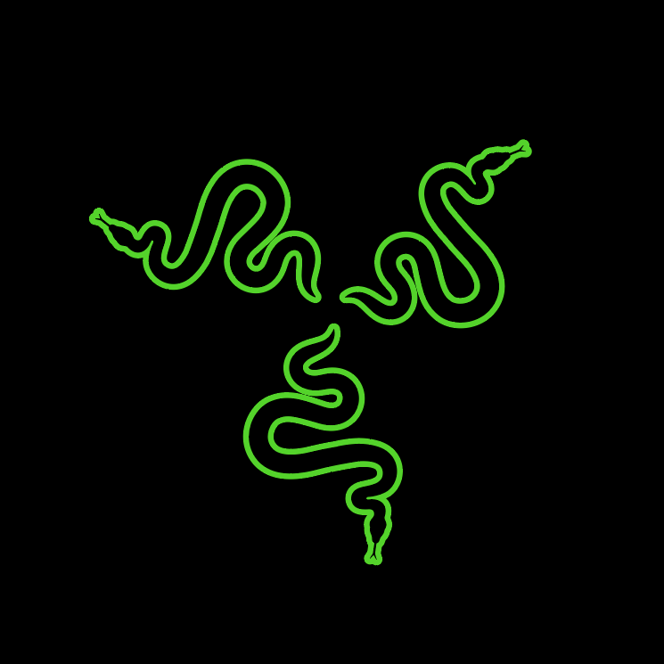
Inspired by the idea of social distancing to fight COVID-19, Razer unveiled a new logo today on its official Facebook page. The three interlocking snakes on the traditional logo that we're all familiar with are now individual snakes avoiding contact with one another. It's a simple take that hits the mark in terms of messaging and even marketing during these times of economic uncertainty. Razer has been encouraging users on social media to game from home all month long as well.
This isn't the first time where Razer edited its own logo. The company has frequently changed its logo in honor of special events such as Valentine's Day where the logo was pink, gay pride week where the logo was rainbow, and the launch of the Mercury White Blade laptops where the logo was white.
