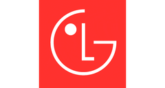
LG has unveiled a new logo with which its PCs, TVs and audio equipment will be branded going forward. Then again, this "re-vamped" icon is still made up of the initials for the company's logo ("Life’s Good") with an added strategic dot with the goal of making it look more like the outline of a cute little one-eyed face.
On the other hand, the traditional font, shading and impression of depth has been phased out of this new version. In addition, it is now mounted on a field of LG's "Active Red" signature color, as opposed to the almost burgundy button of previous years.
LG ostensibly hopes that this will give the logo's visual identity a more youthful feel. That might also be why its 'face' has also been upgraded with a number of moves and gestures, dancing, spinning and winking included, to be seen whenever these new animations are supported.
The general idea seems to be that the (sighted) consumer can still connect with the brand even if they are also testing a new soundbar out in a store at the time, or, as hinted strongly during the introduction of the new visual identity worldwide, have wandered into a virtual space run by the company. Accordingly, this logo-slash-character is how LG intends to "transcend generations and locations" in the future.
Buy an LG C2 OLED (2022) on Amazon


