CheckMag | Fixing the Epomaker TH40 - 110% effort for a 40% mechanical keyboard
Why, Epomaker, why?
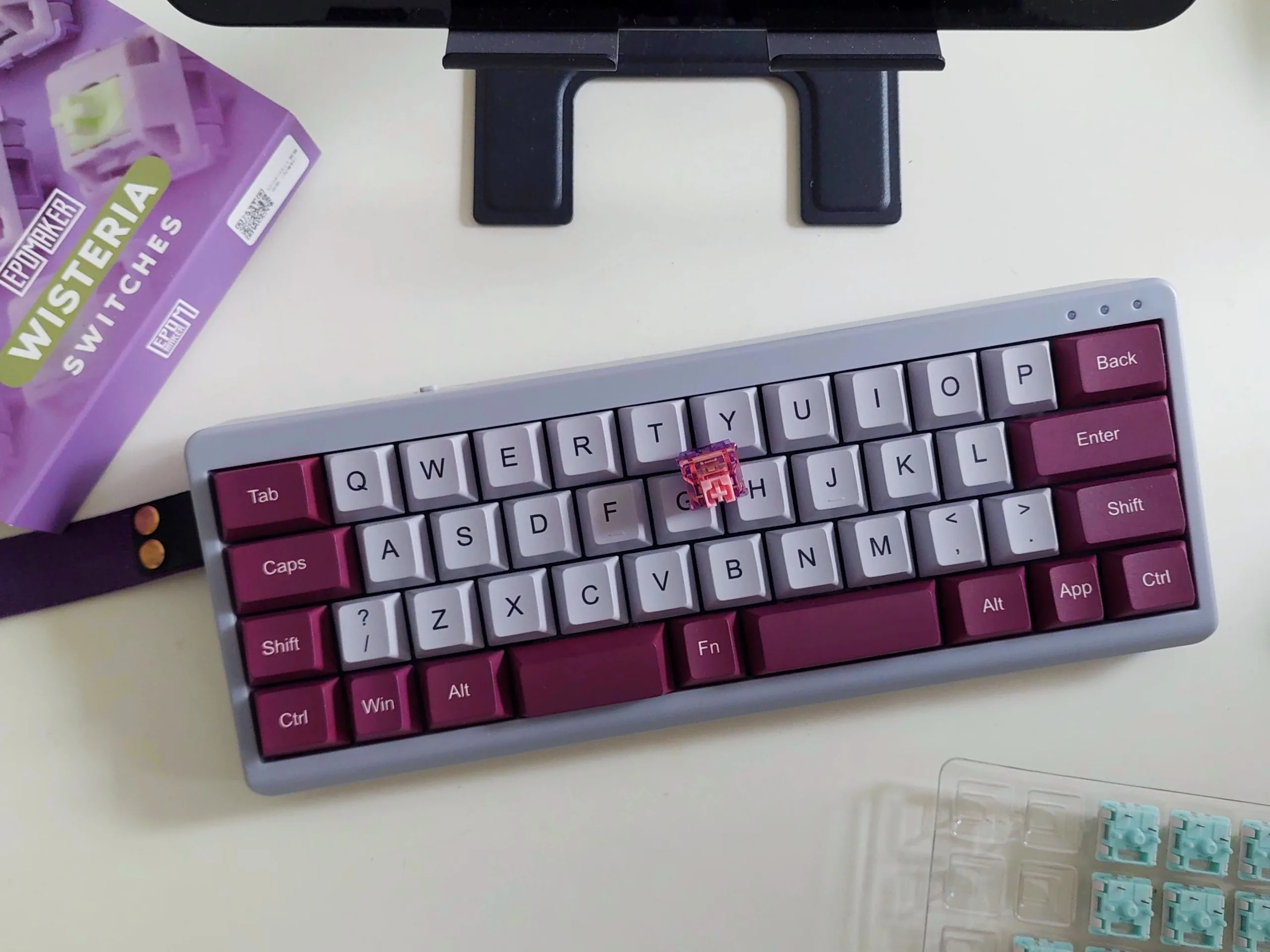
Proponents of 40% mechanical keyboards often tout their ergonomic and efficiency benefits, claiming that moving your hands around less can actually be better for overall comfort and efficiency. There's just one problem — setting up those layers takes time. We recently reviewed the Epomaker TH40, and found it to be a rather charming little keyboard with some glaring functionality shortcomings that need addressing. Without customisation, the Epomaker TH40 cannot be used as a daily driver, which is a real shame, because it's a joy to type on, thanks to its cushy gasket mount, sound-shaping foams, and unique layout.
For the uninitiated, small form factor keyboards often omit certain keys in an effort to cut down size, and 40% keyboards — so named because they only have around 40% of the keys found in a full 104-key keyboard — take this minimalism to the extreme, omitting everything from navigation keys to number and function rows, going so far as to exclude certain punctuation keys.
In order to access those "missing" keys and functions, keyboard designers include multiple layers, which work on the same principal as using Shift (eg. Shift + 2 for @) to access punctuation on a normal keyboard, except in this case, you can have multiple layers hiding various different keys under the stock layout.
In the process of creating our recent review, we set aside some time to optimise the Epomaker TH40 using VIA. Although ergonomics and usability are always going to be subjective, we came up with a configuration we believe is a far sight better than what Epomaker ships in the box.
Base layer/layer 0 - minor quality of life tweaks
For the most part, the Epomaker TH40's base layer is acceptable, even if it lacks core functionality, like Delete, and the split space bars present a neat opportunity to make better use of one's thumbs — they are the strongest and most dextrous digits we have, after all.
With these observations in mind, the left space bar on our TH40 became Left Shift, instead of Space, reducing the strain required to hold shift and actuate another alphanumeric key. Caps Lock also bit the dust, with the caps lock key becoming a macro that backspaces a whole word (Ctrl + Shift + ←, Delete). This was a personal preference, and replacing Caps Lock with a standard Delete may be more sensible for most users.
Using Backspace or Delete with a pinky is less than ideal, but this compromise avoids dramatically changing the rest of the base layer and helps keep the fingers on the home row. Creating a whole-word delete also helps reduce the amount of time spent off the home row, which is generally accepted as an efficient way to type.

Right Alt and the App key were swapped, with Right Alt then becoming Fn2, allowing easy access to the second layer, which we will get into later. This lets us dedicate different layers to frequently used functions or key chords while reducing hand strain by triggering layer 2 with the right thumb. Another minor change was swapping out the /? key for a plain question mark, again reducing the amount of work needed to type a common punctuation symbol and moving / to layer 1.
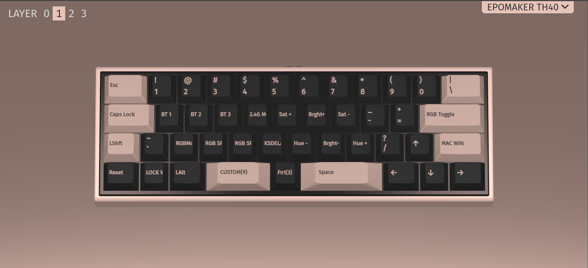
Layer 1 - clawing back sacrificed functionality
Layer 1 on the Epomaker TH40 was a weird mess of RGB controls, punctuation, and connectivity options. While this is great for YouTube reviewers to show off the keyboard's flashy lighting and connectivity options, it isn't particularly functional for daily use, especially since the non-shine-through keycaps mean most people will likely disable RGB anyway. As such, layer 1 received an almost complete overhaul in the name of productivity.
The number keys in the top row from Q to P makes enough sense that it was left unchanged, especially for anyone coming from something like a 60% layout. Common symbols, however, were added to the home row, starting with the exclamation mark on Caps Lock, the @ symbol on A, $ on S, percent on D, and ^ on the F key.
These changes came about as a way to access common symbols without having to hold Fn1 + Shift, and then try to hit a key above the home row. Now, Fn1, between the space bars, brings those symbols to the top for easy access and no uncomfortable movements.

The rest of layer 1 received some significant changes, though. Gone is the Win/Mac mode shortcut on Right Shift, replaced instead by End, while Enter above it became Home, making navigating webpages and text fields far more convenient.
There are other navigation-specific changes for layer 1, like making Super (Win) Fn3 (to access layer 3 when held) and adding more symbols to the right side of the home and bottom rows. On the non-navigation side, layer 1's G key also became a macro to add an em dash on Linux.
Depending on your use-case, you might even be able to stop here, since that covers most of your general-purpose functionality basics, but we're still missing the all-important Function row (F1–12) for common shortcuts, like Alt + F4 for quit or F5 to refresh a page.
Layer 2 - F-row time
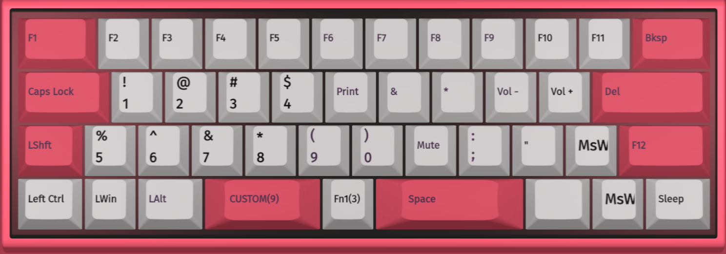
Layer 2 was entirely un-configured in the TH40's stock configuration, which meant starting from scratch. In this case, the most important thing was having an F row, and that F row was placed on the top row, starting with F1 on the Tab key and ending with F11 on P. F12 was placed on Right Shift, since backspacing would otherwise require releasing the Fn key, resulting in potentially confusing, clunky movements when incorrect punctuation is entered.
A handful of common punctuation symbols were also included on the right side of the keyboard on layer 2, while volume controls, Scroll Up and Scroll Down, and Sleep also made sense to include in layer 2 for easy controls and basic webpage navigation without having to leave the keyboard.
Layer 3 - keyboard configuration and RGB controls

By now, the TH40 has its basic and extended functionality back and can easily be used as an everyday productivity keyboard, potentially even more comfortably than a full-size keyboard after some adjustment. All that was left to do was return those troublesome connectivity selectors and keyboard configuration shortcuts, which we removed from layer 1 in favour of some more useful keys.
The Bluetooth device selection shortcuts were put in their usual A, S, and D spots in layer 3, since those keys illuminate by default when pairing, regardless of whether you rebind the shortcut. The idea behind burying these features in layer 3 means they're a little less likely to be accidentally triggered during normal use. Other potentially useful functions like Screen Brightness, RGB controls, and a Keyboard Reset button were also placed on layer 3, mostly just to have them around in case they were needed.
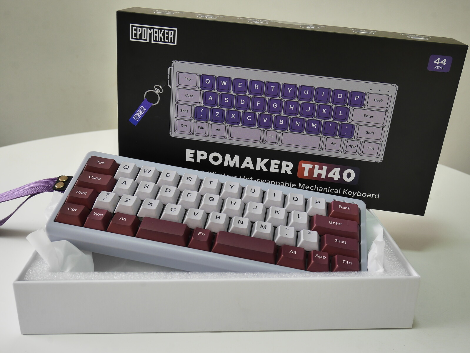
If you're looking to pick up a 40% keyboard, the Epomaker TH40 provides a pretty compelling value at around $80 on Amazon — less when on sale — especially compared to other 40% keyboards, which generally require some assembly and can run you upwards of $100. This article is meant to serve as an easy way to get started on the compact 40% layout for anyone coming from a larger layout. It's also worth noting that remapping a keyboard in this manner, while it can make you a more efficient typist, will take some getting-used to. It helps to take screenshots of each layer for reference, in case you get lost.
