Android 17: Leak reveals improved notifications and quick settings
Details about Google's gaming plans for Android 17 were leaked last November, and now leaker Mystic Leaks has published the first screenshots showing the new user interface for notifications and quick settings.
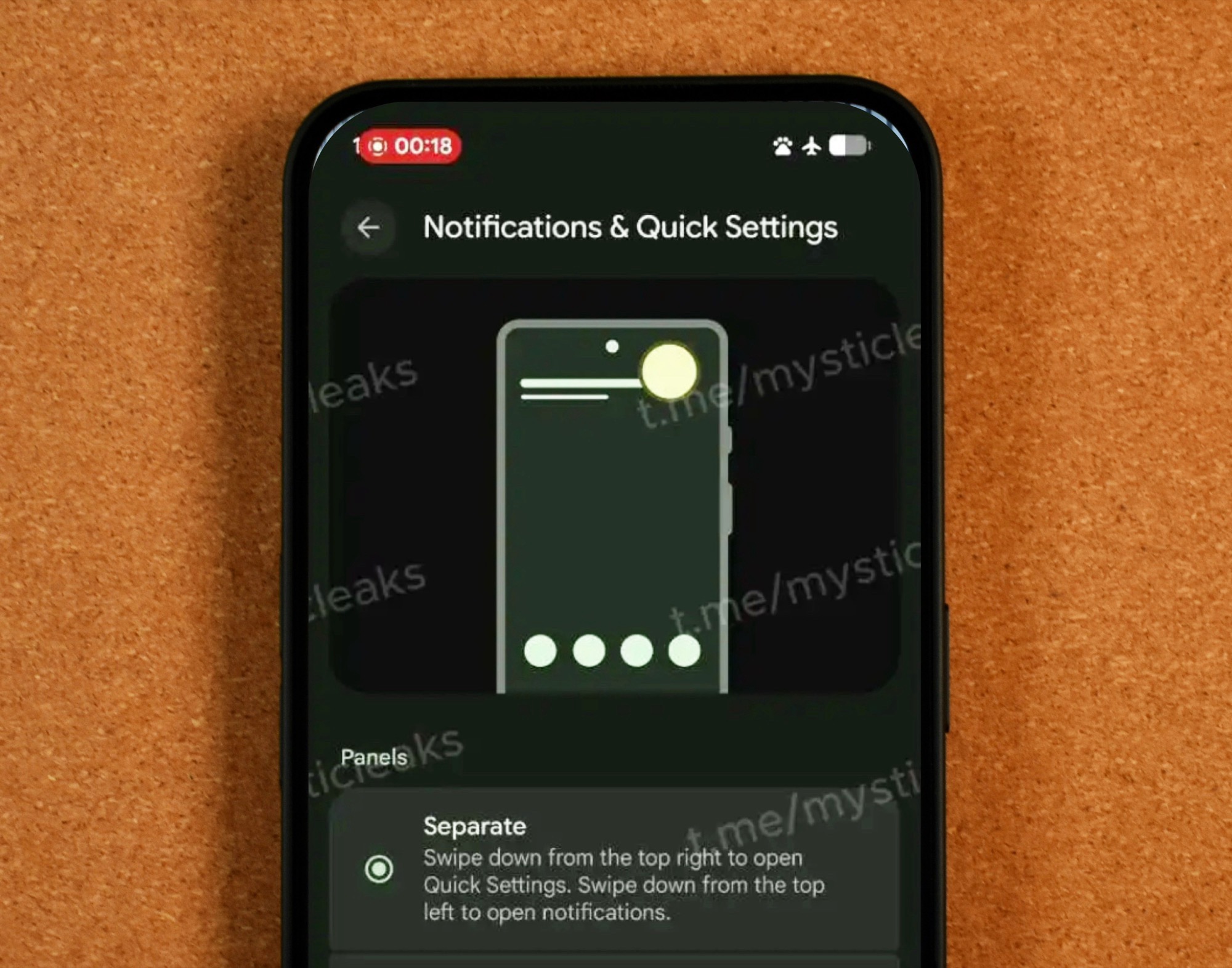
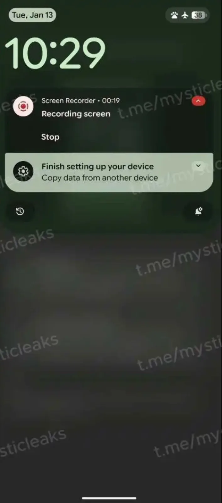
According to these screenshots, Android 17 will only display quick settings by default when swiping down from the top right corner of the screen. Swiping down from the top left corner of the screen, on the other hand, will display notifications. This is already familiar from the Apple iPhone 17. Users who don't like this change can switch back to the familiar Android user interface in the system settings, which combines quick settings and notifications on a single screen.
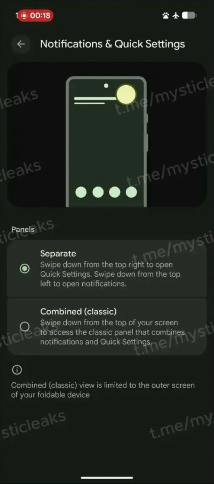
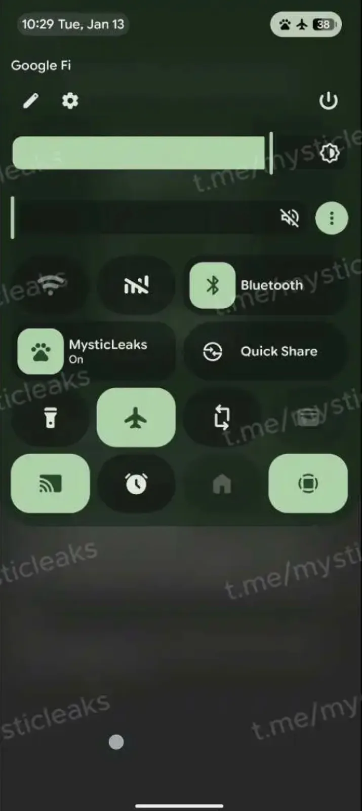
The new split layout has the advantage of providing more space for displaying notifications or quick settings, reducing the amount of scrolling users have to do to get to the item they want. Google uses this space, among other things, to place an additional volume slider below the display brightness setting. The design of the other quick settings remains largely unchanged. However, this is likely still an early beta version, so it's reasonable to assume that further design adjustments will be made before the release of Android 17 around June 2026.
With this new layout, Google is moving closer to the Apple iPhone, although the quick settings in iOS 26 can be spread across several pages, allowing users to set up separate quick settings to control their smart home, for example.
Source(s)

