CheckMag | Steam Machine: Top community-made concept designs (so far)
Valve’s new Steam Machine landed this week, and it’s already the topic everyone’s posting about. The metal cube design, SteamOS focus and the modular front panels Valve teased have left room for one thing the company didn’t fully plan for: a loud, hilarious community reaction. Artists and modders have been posting concept renders and skin ideas across Reddit. A (somewhat) simple black box has apparently become a canvas for a whole lot of personality.
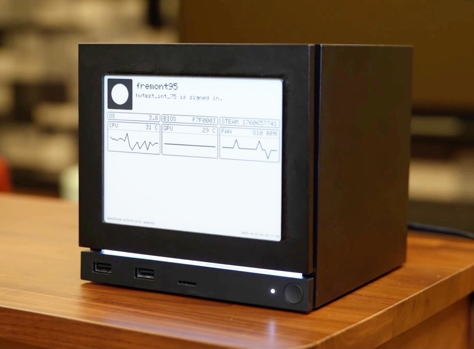
Beyond the jokes, however, there’s a real thread here. The official device is a compact, living-room-focused cube that runs SteamOS with Proton compatibility, uses microSD for library portability with the Deck (curr. $743 on Amazon), and has magnetic, swappable front panels - one of which surfaced with an e-ink test display. That modest hardware brief gives creators a predictable template to bend: a flat front face, a compact footprint, and room for either decorative art or functional displays. Here are eight community designs that stood out, and what they reveal about how fans imagine the Steam Machine’s future.
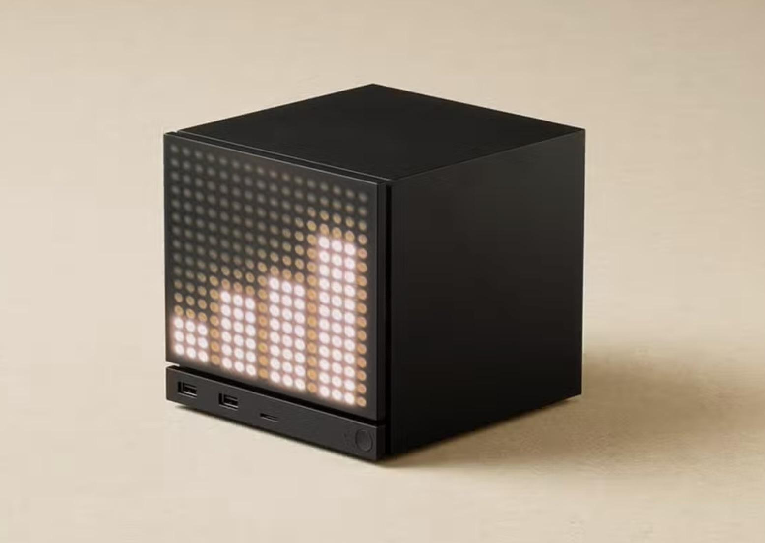
1. The dot-matrix music visualizer
One concept turns the Steam Machine’s front into a full dot-matrix LED display that responds to audio. It’s a neat reference to desktop visualizers of the 2000s and to modern smart-speaker designs. The idea means people want more than static skins - they like live feedback and small, glanceable features that should make the cube feel alive beside the TV.
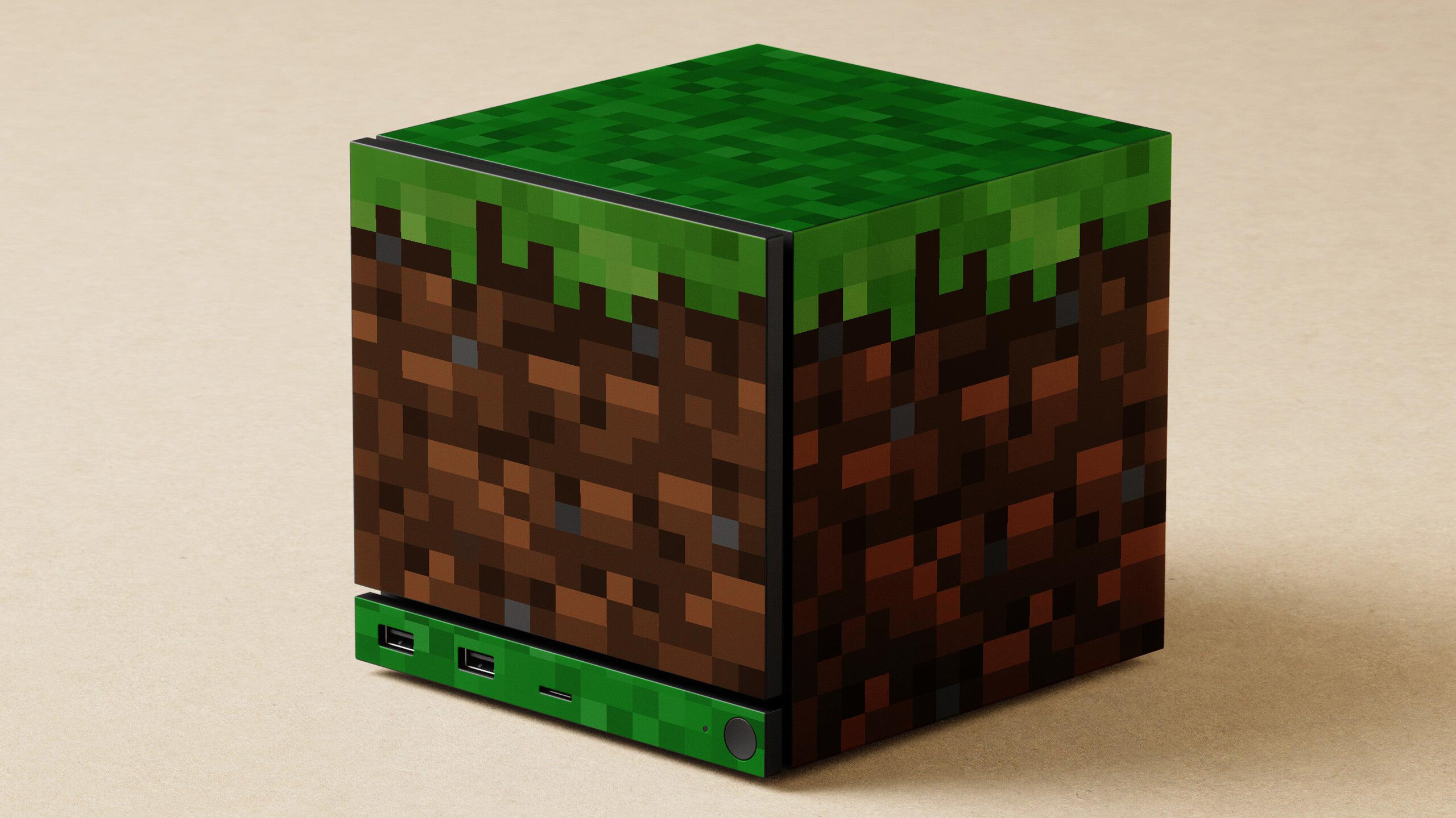
2. Minecraft grass block skin
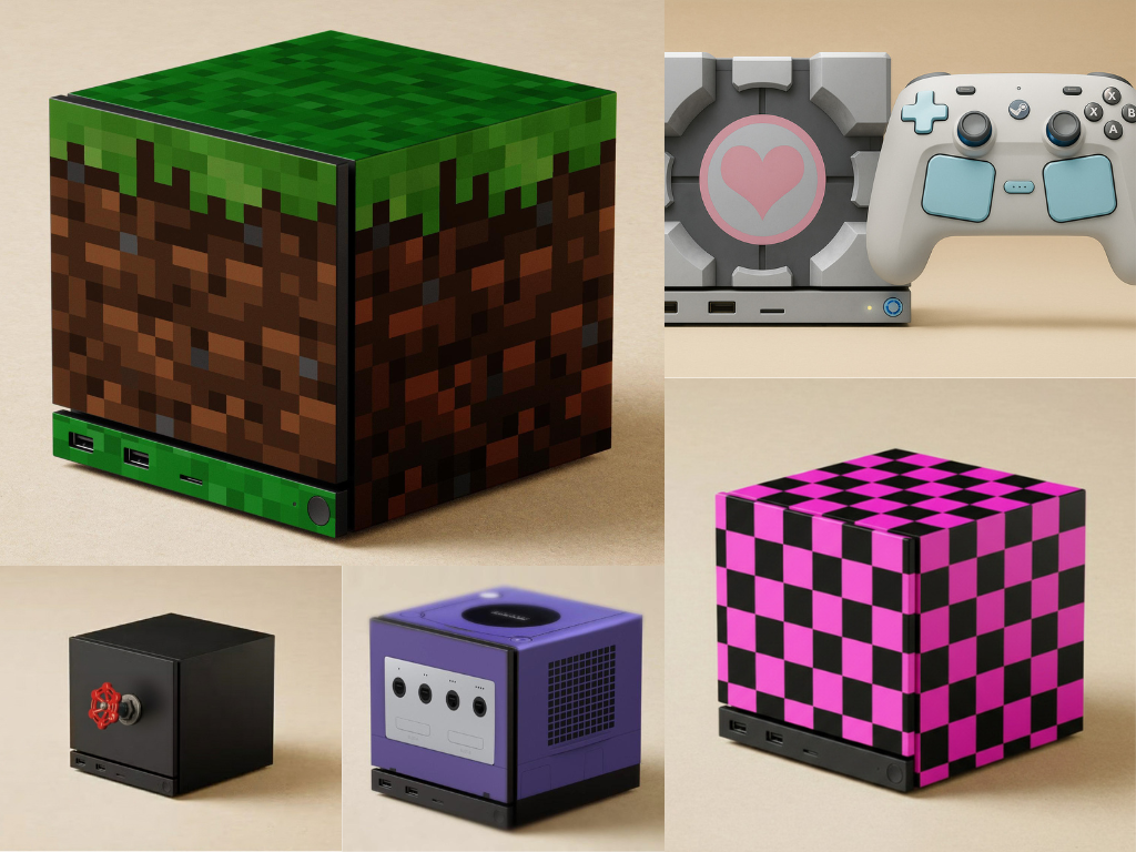
A pixel-art Minecraft wrap changes the cube into a single block of the game’s world. It’s both good-looking and practical: the low-res texture actually reads quite well on a flat surface and keeps the cube readable at a distance. This concept suggests that franchises with strong design languages could actually provide official skins people would buy, not just mock up for fun. This one feels like an easy win for a third-party skinmaker.
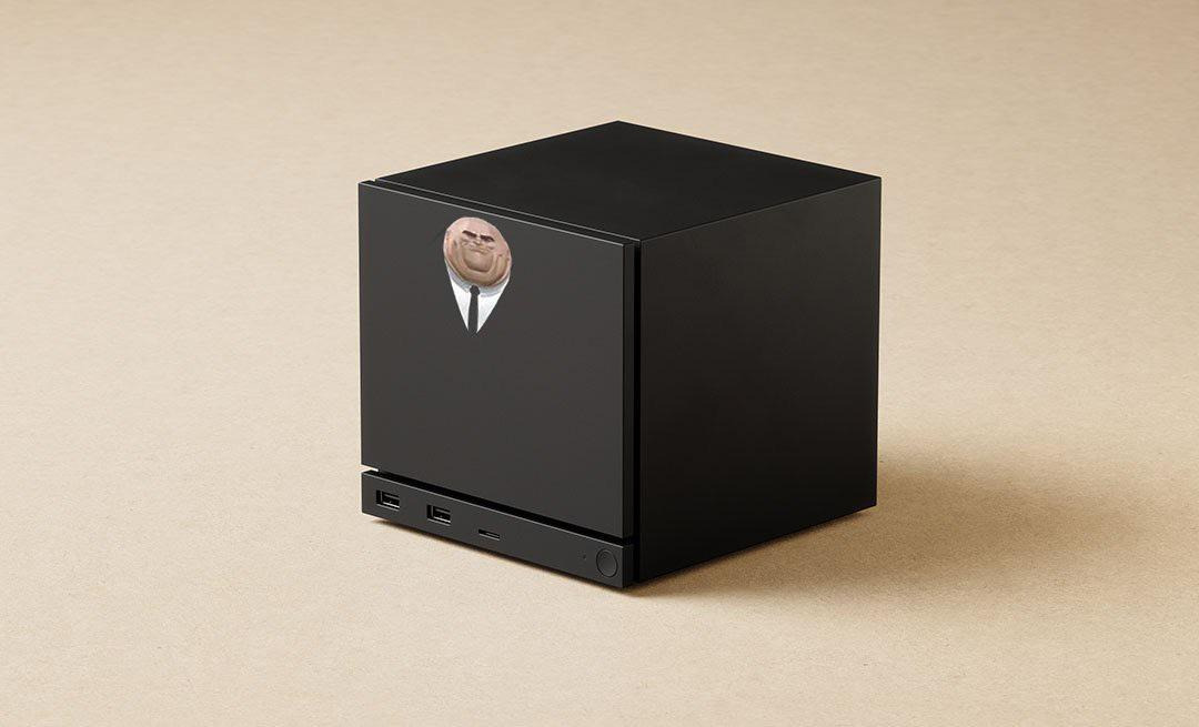
3. The Kingpin machine
This concept draws similarities between Marvel Universe's Kingpin and the blocky form-factor of the Steam Machine. Probably one of the simplest (yet most hilarious) designs in this list, it feels like Kingpin's head was meant to be on here. Plus, the version of Kingpin here is the same one that appears in the Spiderman: Into the Spiderverse, and fans of the movie know that he is comically comic-accurate in this one.
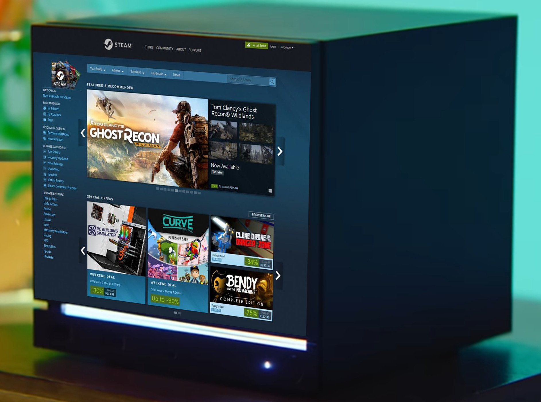
4. Full front Steam UI display
This mockup is one of the harder ones to execute: the entire front face acting as a live Steam interface. It shows the Store page, complete with featured titles and deals. It’s obviously unrealistic today, but the image reflects that people would love front panels that do something, not just sit there. The render unintentionally validates Valve’s decision to explore display-based fronts in the first place.
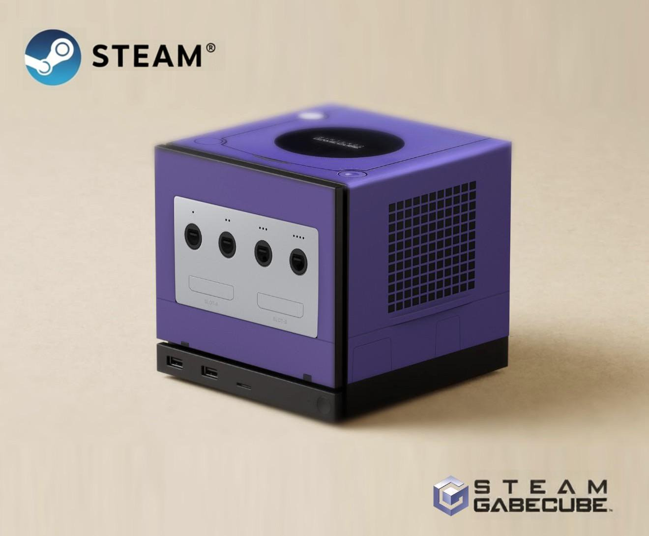
5. The "GabeCube" GameCube homage
A purple GameCube-themed Steam Machine blew up for obvious reasons. The shape is similar enough that the crossover feels natural, and the design nails the nostalgia-heavy details: controller ports, vents, and the purple tone that everyone associates with Nintendo’s cube era. We know how quickly fans link new hardware to old silhouettes, and how much cultural weight those older designs still carry - and this right here is just another testament to the same.
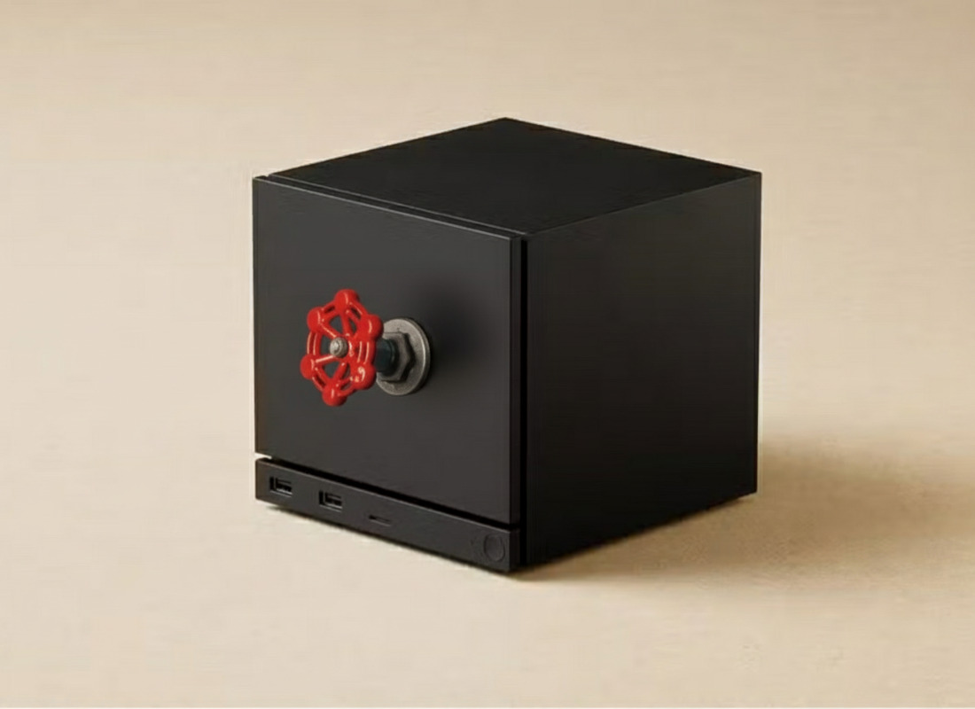
6. Red Valve handle cube
Someone imagined the iconic red Valve wheel on the front of the machine, and it actually looks quite good. It’s a direct pun on the company’s name and Valve's branding, sure, and while it’s clearly not intended as a real accessory, it does raise a good point: the Steam Machine’s flat surfaces make it surprisingly easy to bolt on physical props. It wouldn’t be shocking if novelty front-panel knobs became an actual category on Etsy.
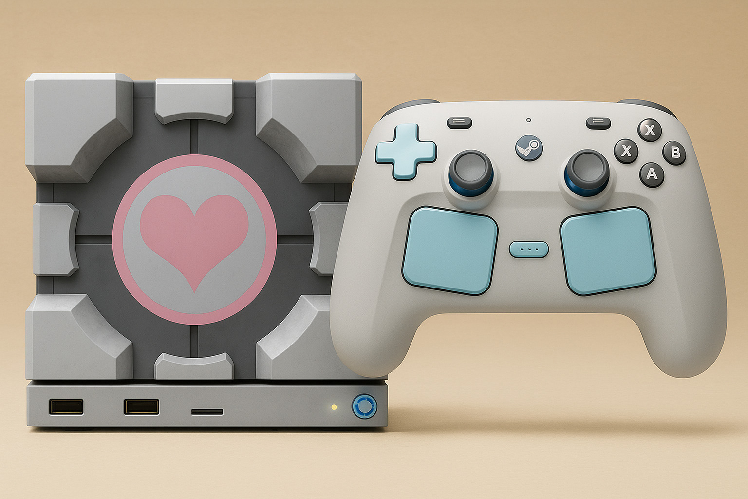
7. Companion Cube
This one is more polished than playful, and as of November 13, Dbrand has officially teased a Companion Cube skin that'll launch alongside the Steam Machine in 2026. The render turns the box into a Portal-themed Companion Cube, complete with a matching controller in soft greys and pastel blues. Compared to the more meme-ier designs, this shows what a premium themed bundle could look like if Valve or a partner ever made one. The clean execution also proves that the form factor can support cohesive, franchise-aligned accessories that feel collectible rather than gimmicky.
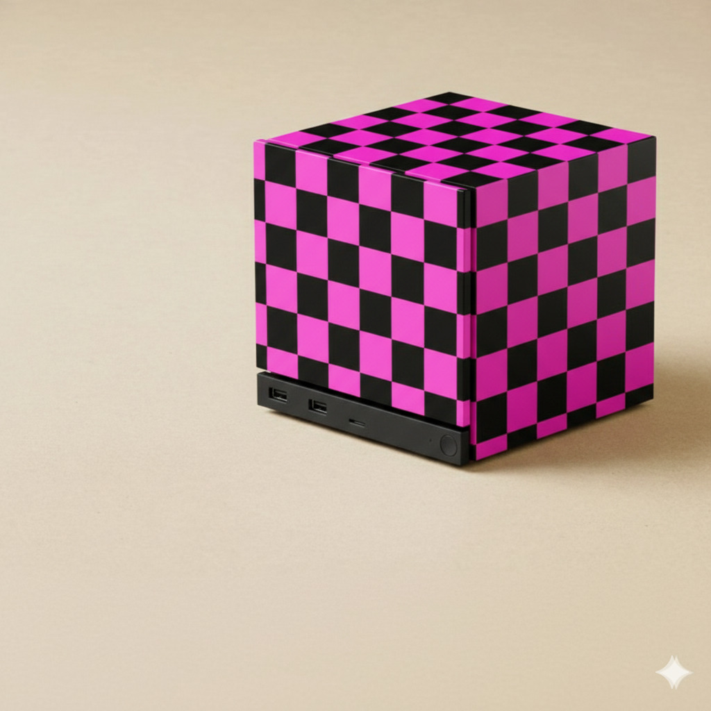
8. Pink-and-black missing-texture checkerboard
In this one, the cube is wrapped in the pink-and-black checkerboard pattern that Source Engine games use to indicate a missing texture. Anyone who has played a modded Source map should know this instantly. It’s a self-aware joke that has ties with Valve’s own engine history. More importantly, it uses a simple geometric pattern that fits the cube beautifully. This is the kind of skin that looks loud but still clean, and the joke would (hopefully) land even for casual players.
There are also limits. Several concepts assume the front panel can be interactive or display high-refresh graphics; Valve’s current e-ink test suggests low-power, low-refresh options are more likely at launch (even though the company confirmed that this add-on is only intended for internal testing and will not hit the market). Legal and licensing hurdles could keep a lot of official franchise skins limited unless Valve partners with rights holders. Still, the appetite for third-party skins and novelty front covers is more than just obvious - and that’s a practical opportunity for accessory makers.
Source(s)
