Devs: Mirror’s Edge’s clean white city a practical fix, not a pure artistic vision
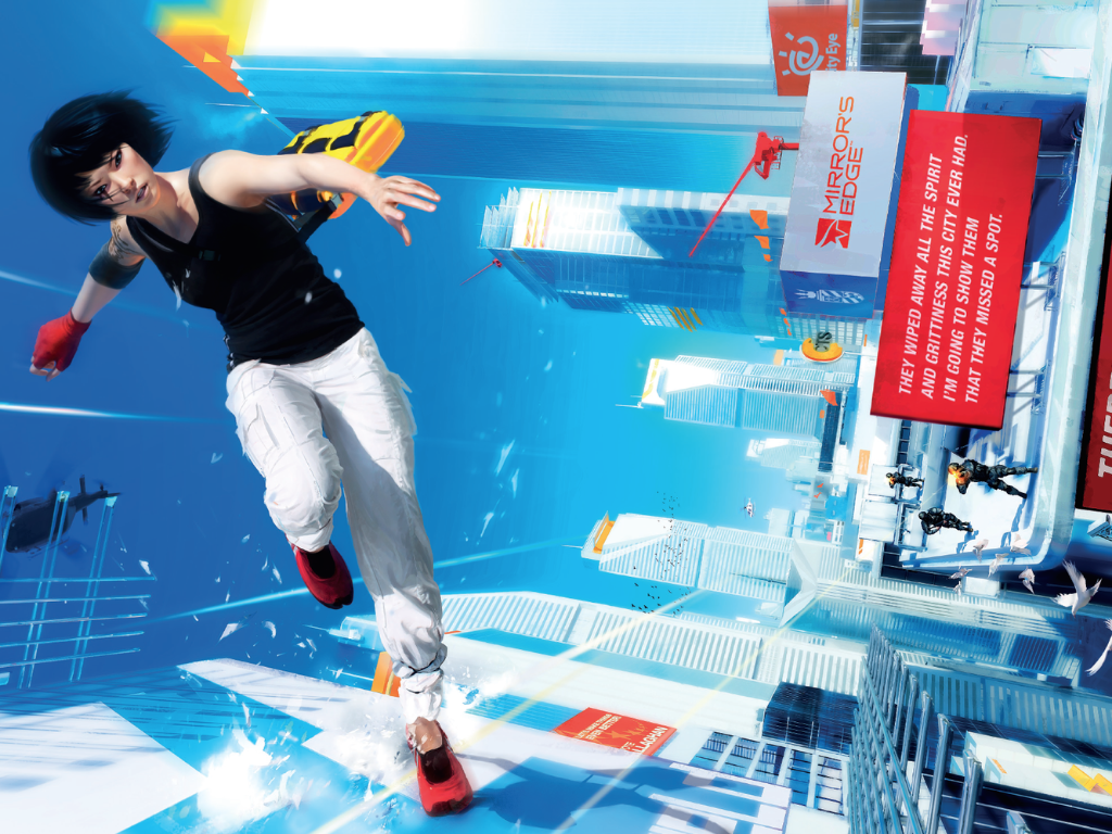
The developers behind the iconic parkour game from 2008, Mirror’s Edge, recently sat down with Design Room to discuss the game’s initial concept design. While we’re accustomed to the game’s sterile white atmosphere, accentuated by red guiding indicators such as ledges, doors, and poles, the original concept was different.
Mirror’s Edge was initially prototyped to resemble a gritty, brown, dystopian city, similar to many Unreal Engine games of its time. But the developers had to ditch this idea because the fast-paced movement and parkour mechanics caused them severe motion sickness, similar to what happens when playing Mirror’s Edge on a VR headset.
Senior producer Owen O’Brien noted that the initial design led to bouts of nausea quite quickly, prompting the design team to change the setting to a cleaner, less-detailed yet equally beautiful world that mitigated motion sickness, ultimately giving Mirror’s Edge its iconic bright charm, which is praised even to this day.
So, Mirror’s Edge’s core artistic design came about as a result of necessity rather than a pure artistic vision. O’Brien explained in the interview, “Mirror’s Edge started off looking like every other Unreal game, to be honest.”
The problem occurred when early testers began moving at high speeds through detailed environments, causing a mismatch between what users perceived on the screen and their bodies’ expectations.
He further added, “We found that when you were moving very fast through the world, you got motion sickness very quickly. We discovered that it was less if you made the world cleaner and less detailed.”
Art director Johannes Söderqvist also chimed in and described the prototype as “pretty brown, like a regular game, if you will. It wasn’t bad; it looked good, actually. But there was no style to it, or a fairly generic style.”
Given the motion sickness issue and the generic seventh-generation console art style, O’Brien pushed the team to experiment with the game’s artistic scope and to stand out. He recalled, “I said to the team, I want to look at a screenshot of Mirror’s Edge in a magazine and know it’s our game.”
So, Söderqvist and the design team began experimenting by stripping color from textures to create vast liminal spaces, which were accentuated by flickers and specks of bold greens, blues, reds, and yellows throughout the levels.
Mirror’s Edge was released for the PlayStation 3 and Xbox 360 back in 2008 and sold over 2.5 million copies. It was praised for its innovative gameplay and world design, but was criticized for its lackluster story.
The game received a 2016 reboot called Mirror’s Edge Catalyst. It stepped things up a bit with its open-world design but offered little more to do in its new world, and also suffered from users experiencing the same storyline, which negatively affected sales. However, it did go on to influence parkour in games like Dying Light.
Source(s)
