iOS 26.1 beta lets you adjust the Liquid Glass transparency with a new toggle
One of the most noticeable changes in Apple’s iOS 26 was the new Liquid Glass UI redesign. I loved it from day one and still do, though it’s fair to say not everyone shares that view. While the new interface is certainly modern, its heavy reliance on transparency has drawn criticism, with some users finding it impedes usability and even draws comparisons to the Windows Vista Aero aesthetic. The main complaint from many users, however, is that the see-through elements can make text and buttons difficult to read against various backgrounds.
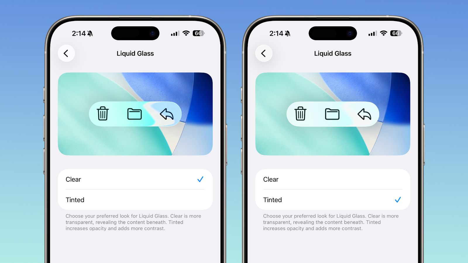
Apple did seem to hear this feedback during the initial beta period, as the company toned down the transparency for the final public release. However, for a portion of users, the effect remains too distracting. In response, the upcoming iOS 26.1 update appears to include a direct solution. The latest beta, which was recently released, introduces a new toggle that gives you control over the transparency levels, a clear sign Apple is addressing the usability complaints.
This new feature, found in Settings > Display and Brightness, is not a slider but rather a simple two-choice setting. You can select "Clear," which is the default Liquid Glass effect, or the new "Tinted" option. Choosing "Tinted" increases the opacity of the interface elements and adds more contrast, which should be a welcome adjustment for anyone who finds the current design a usability challenge.
This new toggle is also present in the corresponding betas for iPadOS and macOS Tahoe 26.1, indicating a system-wide adjustment. Hopefully, the final version of iOS 26.1 is released soon, allowing all users to take advantage of this new setting and customize the interface to their preference.
Source(s)
