Twitter testing out new layout for its iPad app
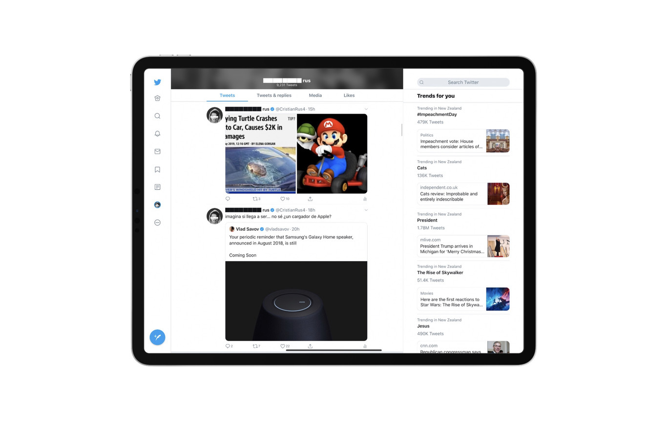
The Twitter app on iPad has always been problematic: it has the same interface as the iPhone version, not at all optimized for the iPad’s larger screen. This seems set to change, finally. Applesfera reports that Twitter is testing out a new iPad-friendly design that will display more content on the bigger screen. Notably, the interface will feature three columns instead of the two columns found on iPhone and the current iPad version.
The new interface appears to significantly improve usability. Earlier, if you were to use Twitter on the iPad in landscape mode, there’d be huge blank spaces on-screen. The triple-column design addresses this.
The new design is closer in function to the browser-based desktop app. This is in line with Apple’s desire to position the iPad as a viable alternative to PCs and notebooks. Safari on iPadOS 13, for example, shows the desktop versions of websites by default. And, while well-hidden in the accessibility menu, iPadOS also features mouse support.
It must be noted that the new Twitter design is undergoing limited testing. It’s not available to everyone. If you see the triple-column layout on your iPad, though, you are in luck.
Source(s)
