"Steve Jobs would've fired everyone": iOS 26 Liquid Glass UI comes under fire for poor readability
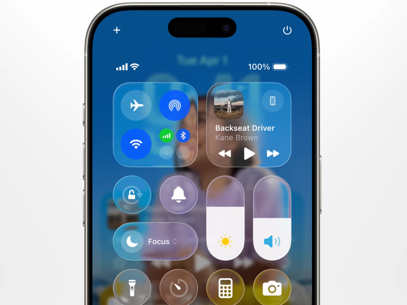
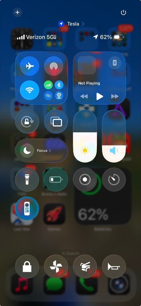
“Steve Jobs would have fired everyone” was the reaction of one X user upon seeing Apple’s new “Liquid Glass” software design in action. The post, which has garnered over 18.5 million views on X, references the iOS Control Center sporting the new UI design to show how the Liquid Glass’ transparent nature and soft blur take their toll on readability.
During its WWDC25 keynote, Apple emphasized that UI elements crafted out of Liquid Glass aim to be “more expressive and delightful” while “dynamically transforming to help bring greater focus to content”. So, it is clear that Cupertino’s ambition with the new UI, which extends across its ecosystem from macOS 26 to TVOS 26, is a modern, stunning UI redesign that doesn’t compromise functionality/usability.
For the most part, Apple has achieved this. The new iOS 26 UI, for instance, is super clean with some of the best animation work in the industry. Individual UI elements feel alive with a soft bounce and context-aware dynamic interactions. However, it is the visual characteristics of Liquid Glass design that seem to be causing the most problems.
Take, for example, the case of the iOS Lock Screen. Our very own Vaidyanathan S. shows on X that iOS 26 Lock Screen looks noticeably cleaner and easier to read with transparency turned off.
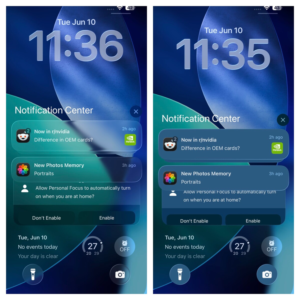
Readability also suffers when the UI is in the new “Clear Light” mode. Due to the translucency effects of Liquid Glass, the UI on iOS 26 looks best when using in the “Clear Dark” mode.

Potential fixes for the Liquid Glass UI
The most obvious fix is that Apple could implement a more aggressive background blur to make the foreground UI elements stand out. As it currently stands, the background blur is a little too soft, which makes information-dense UI elements like the Control Center less readable.
Another possible fix could be to introduce a color tint in the Liquid Glass material. With this, clear UI elements will stand out against a light background.
In addition to the fixes mentioned above, @XorDev, a graphics programmer, suggests things like Drop Shadows, Tone Mapping, and more as potential improvements.
Fortunately, iOS 26 is still in Beta and won’t see a full release for a few more months. So, Apple has time on its hands to take this feedback and implement some much-needed changes.
