YouTube's controversial video player redesign is popping up again, and honestly, it doesn't look half bad
YouTube is once again shaking up the UI of the web video player. The company has been readying a big redesign since April, and after several refinements and tweaks, the updated version is now popping up again for some users. The good news? It looks like YouTube listened to some of the early backlash. I spotted the new design on my primary YouTube account over the weekend, and here’s what it looks like.
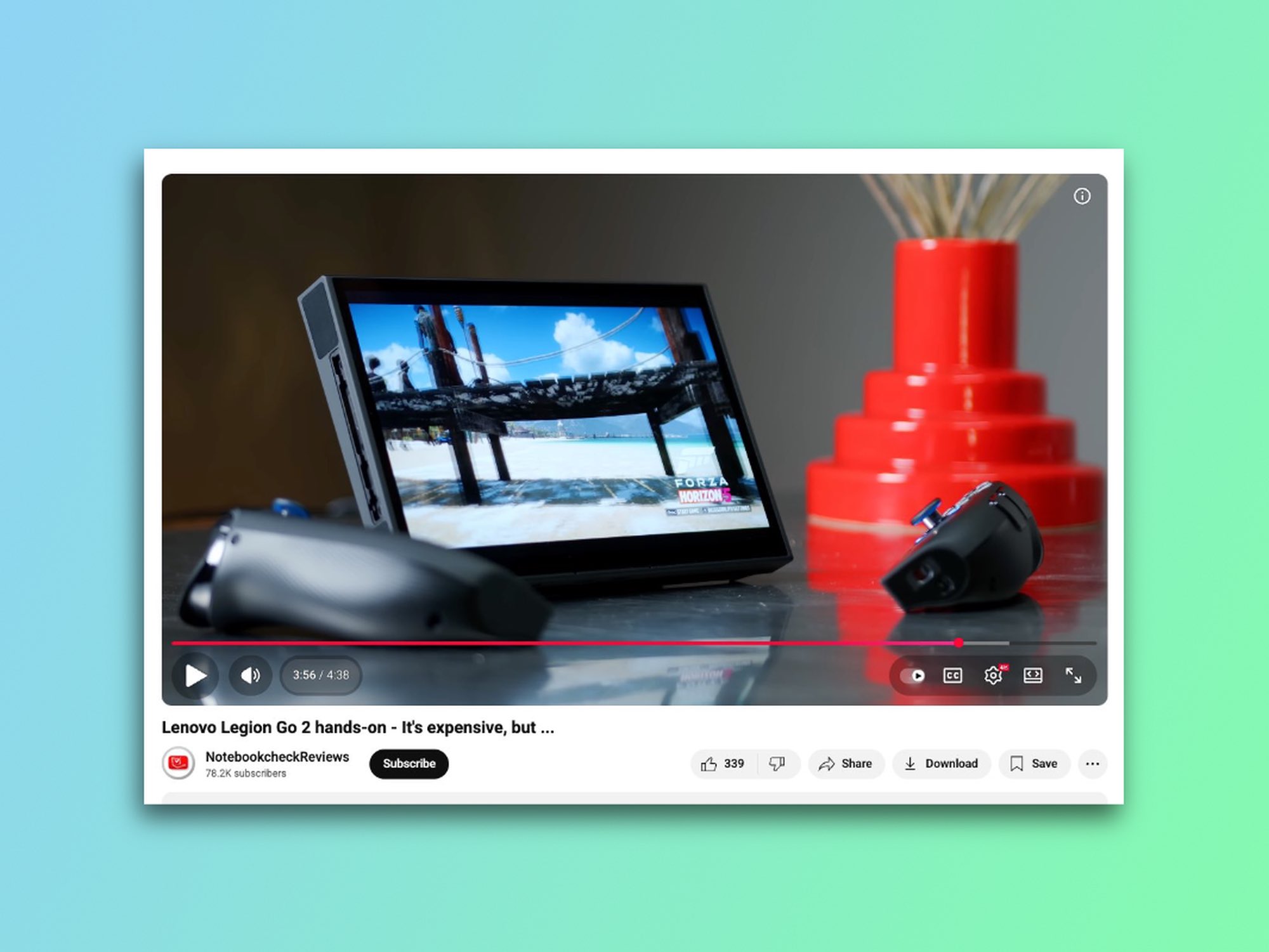
The earlier redesign swapped around familiar controls and wrapped them in floating bubbles. Users weren’t pleased, to say the least, especially with the decision to shove the volume slider into the far right corner. Now, five months later, YouTube is testing a more refined design that not only feels cleaner and more cohesive, but also has an unmistakable Apple Liquid Glass vibe to it. Here's how it compares to the old UI.
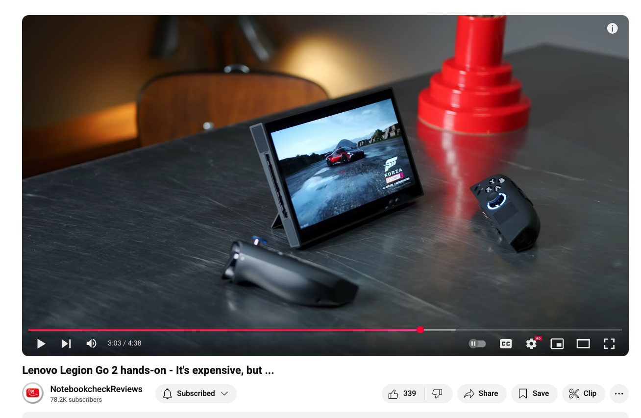
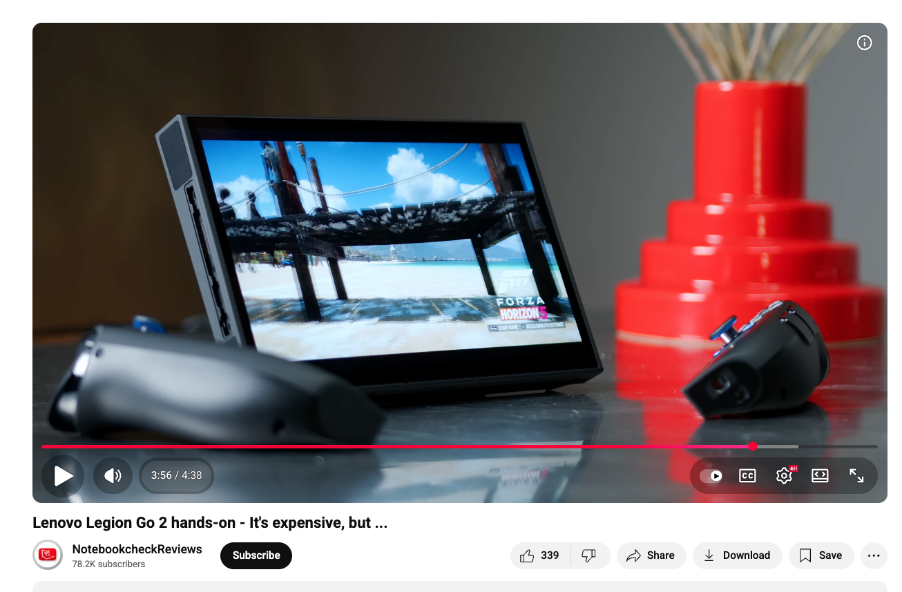
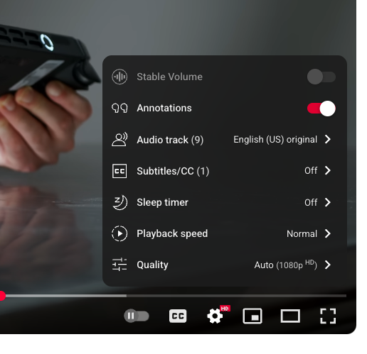
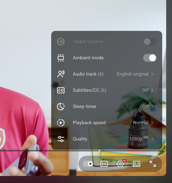
The volume slider is back where it belongs—right next to the play/pause button, and you can still adjust the volume with the up and down keys. Other UI elements, like timestamps and chapter markers, still sit to the left in their own bubbles, while autoplay, subtitles/captions, settings, theatre mode, and fullscreen controls are grouped together in a pill-shaped capsule on the bottom right. I didn’t have a chance to test the previous UI firsthand, but based on photos, the new interface looks slightly more translucent to me. The pills also show a thin black outline when you hover over them, giving a clearer sense of where you’re clicking.
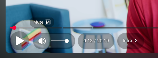
There are some glaring omissions here, though. The skip button is gone, and the mini player toggle on the right side has disappeared, too. I almost never touched the skip button, but some users are obviously going to have a strong opinion about its removal.
I got the redesigned video player on my primary account, but I’m not seeing it on my secondary account or when I open YouTube in incognito mode—some Redditors have reported seeing it too, but it doesn’t appear to be widely available as of yet. Google is notorious for A/B testing UI changes and features that never see the light of day, and there’s no guarantee this YouTube UI redesign won’t meet the same fate (remember the “Related Videos” redesign that got canned after backlash?) That said, the fact that it’s been in testing for the better part of a year and that Google is clearly incorporating the changes from the early feedback, there’s a good chance this UI could see a broader rollout.
YouTube caught a lot of flak when it first showed off this redesign back in April, but I really dig this more refined version. It feels cleaner and modern, and I honestly wouldn’t mind if YouTube pushed this out to everyone. The desktop player has looked basically the same for years, and it's about time it got a facelift.
Source(s)
Notebookcheck; Reddit threads (linked in the article)
