

Samsung Pay gets a new interface
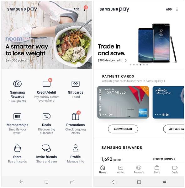
If you are one of the Samsung Pay users who missed having the main navigation buttons in a navigation bar instead of a panel that uses about half of the entire screen estate, then the latest update should make you happy.
Droid Life has quoted a Reddit user known as peachpear123 who posted the news three days ago, right after updating the Samsung Pay app and said the following: "I just updated Samsung Pay from the Google Play Store and I opened the updated app and was like WOW! They have now ditched the on-screen section menus for a more traditional bottom bar now! It looks really clean and everything is really tidy!"
All in all, the new interface is less cluttered and leave more room for the main area of the Samsung Pay app, instead of filling it with (too large) icons with (rather useless) detailed descriptions for Samsung Rewards, Credit/debit, Gift cards, and so on for a total of nine items. Now, to access the favorite items, the user simply needs to pick one of the five items in the bottom bar.
Samsung Pay is a quite popular Google Play app, with more than 50 million installs under the belt. The current rating of the app is an excellent 4.7 that has been reached after more than 414,000 users rated it. The latest version is apparently labeled as 2.8.18 for many users, but this number might be different depending on the Android version and the device it runs on.
Source(s)


