Outlook.com beta shows a redesigned look with useful new features
Microsoft has started a beta test of their new Outlook.com redesign, which is being offered to some users via a pop-up when using the web interface. This beta marks the third redesign in the five-year lifespan of this email service.
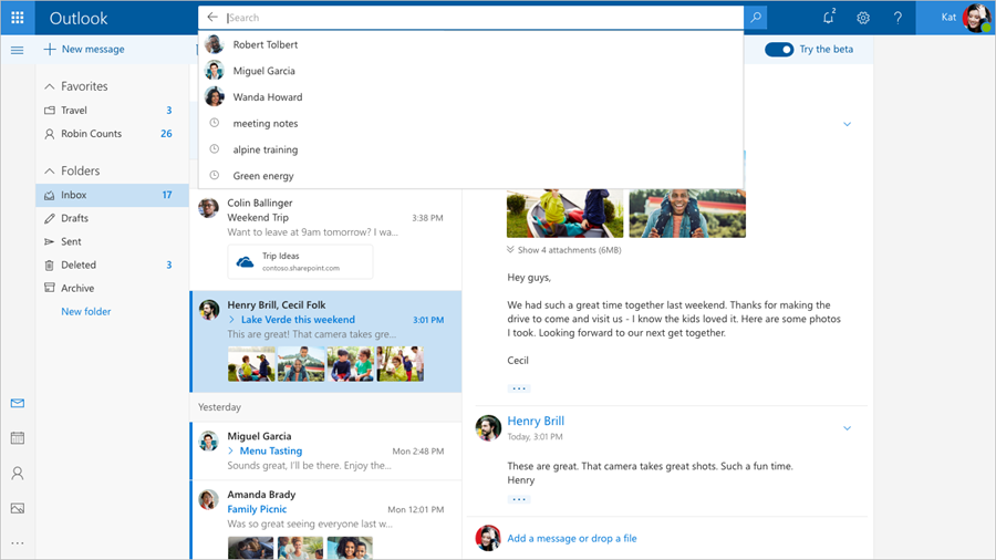
In the last redesign, the search bar received a detailed feature update, and a permanent search field was positioned on the top left-hand side in the folder column. In the new redesign, the search bar is being moved into the top center and will reside in the same row currently occupied by the words "Outlook Mail." This enlarged and centered field will help to emphasize the use of search to find your emails.
Changes are also being made to the email list and conversation view. Depending on which layout view you chose, emails in the inbox list will now show a preview of any attachments, rather than just showing the paperclip icon. If the attachment is a document, there is a small banner showing the document type icon and the name of that document. However, photo attachments will show small thumbnail previews of the first four or so images. This change is a benefit in not only being able to see which emails have attachments easily but also being able to identify the file type.
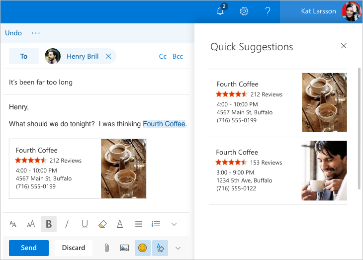
New smart inbox features are being trialed too, which detect when you've typed specific information such as the name of a restaurant or a flight number and offers you additional features such as attaching the location and rating of the restaurant or adding flight schedules.
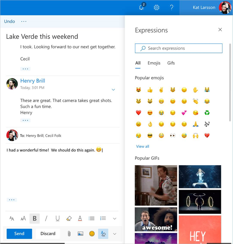
Finally, in a similar fashion to Facebook Messenger, there are now more emojis and GIFs in a pop-out "expressions" sidebar, because apparently, Microsoft heard you liked GIFs or something.
If you don't receive an invite to take part in the beta, then you should only have to wait a few weeks before these features enter the public version of Outlook.com
Source(s)
